


HELPFUL GUIDELINES FOR REFERENCE PHOTOS
The reference photo for your portrait is very important. First and foremost, it should resonate with you emotionally, with regard to your pet’s expression, mood, personality, etc. That said, other factors—most importantly, the quality level of the photograph— are instrumental to an artist’s ability to capture your pet’s distinctive look and spirit. Here are a few helpful guidelines:
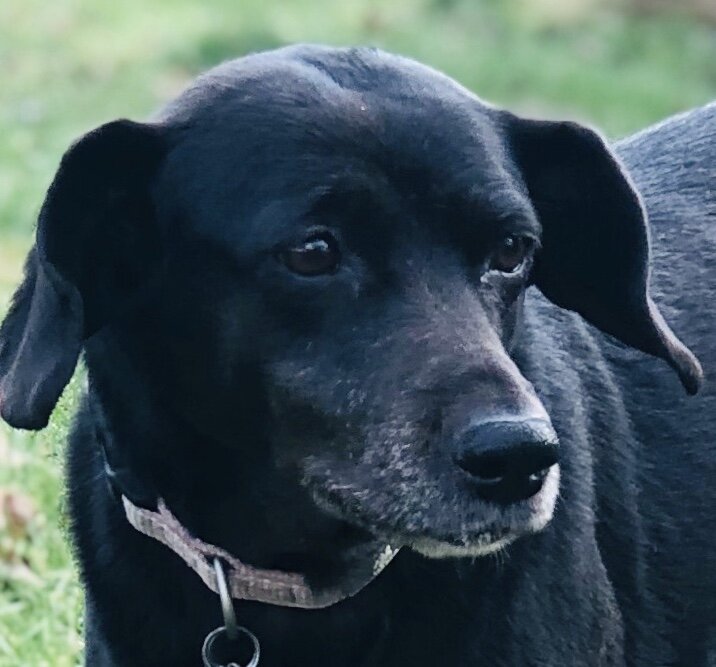
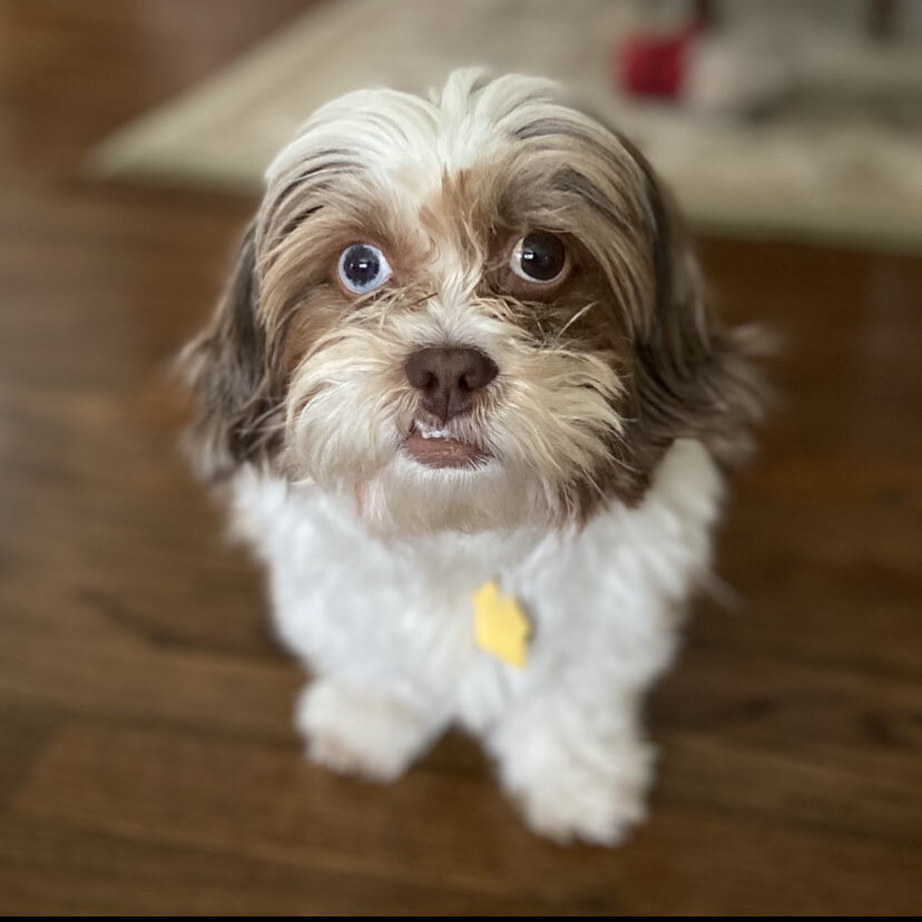
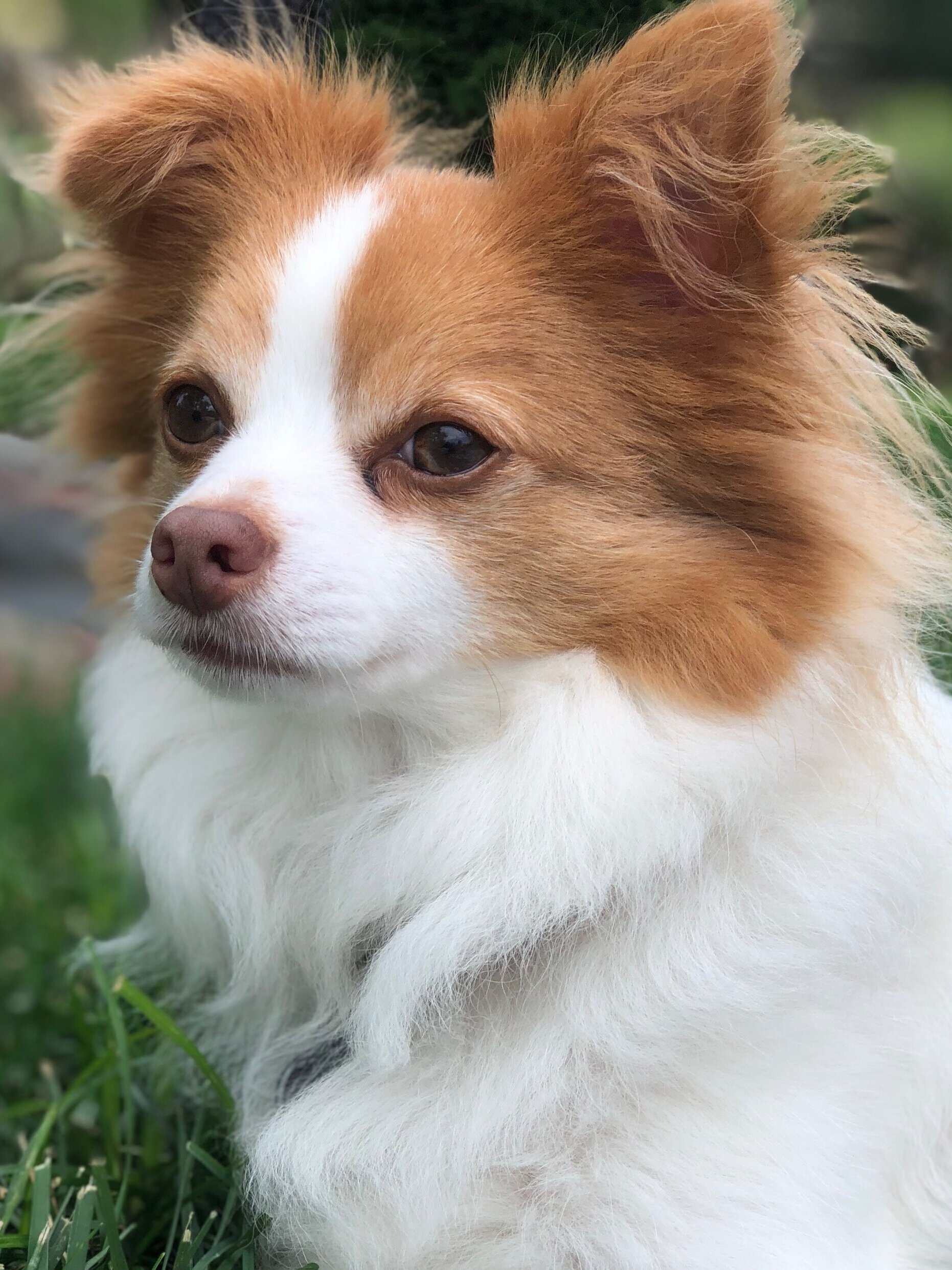
- When taking a reference photo, natural (outdoor) lighting is best. If possible, take a series of photos outside (overcast days are great). Avoid harsh shadows. If you have an indoor pet, take photos in bright natural light near large windows or slider doors. Please do not use a flash as this will flatten the lighting and may reflect unnaturally in your pet’s eyes. Try to achieve the best possible technical quality (sharpness). To do this, avoid zooming in when using a phone camera. This will result in a grainy photo. Instead, get as close to your pet as possible. It’s very important to be able to see details in eyes and fur.
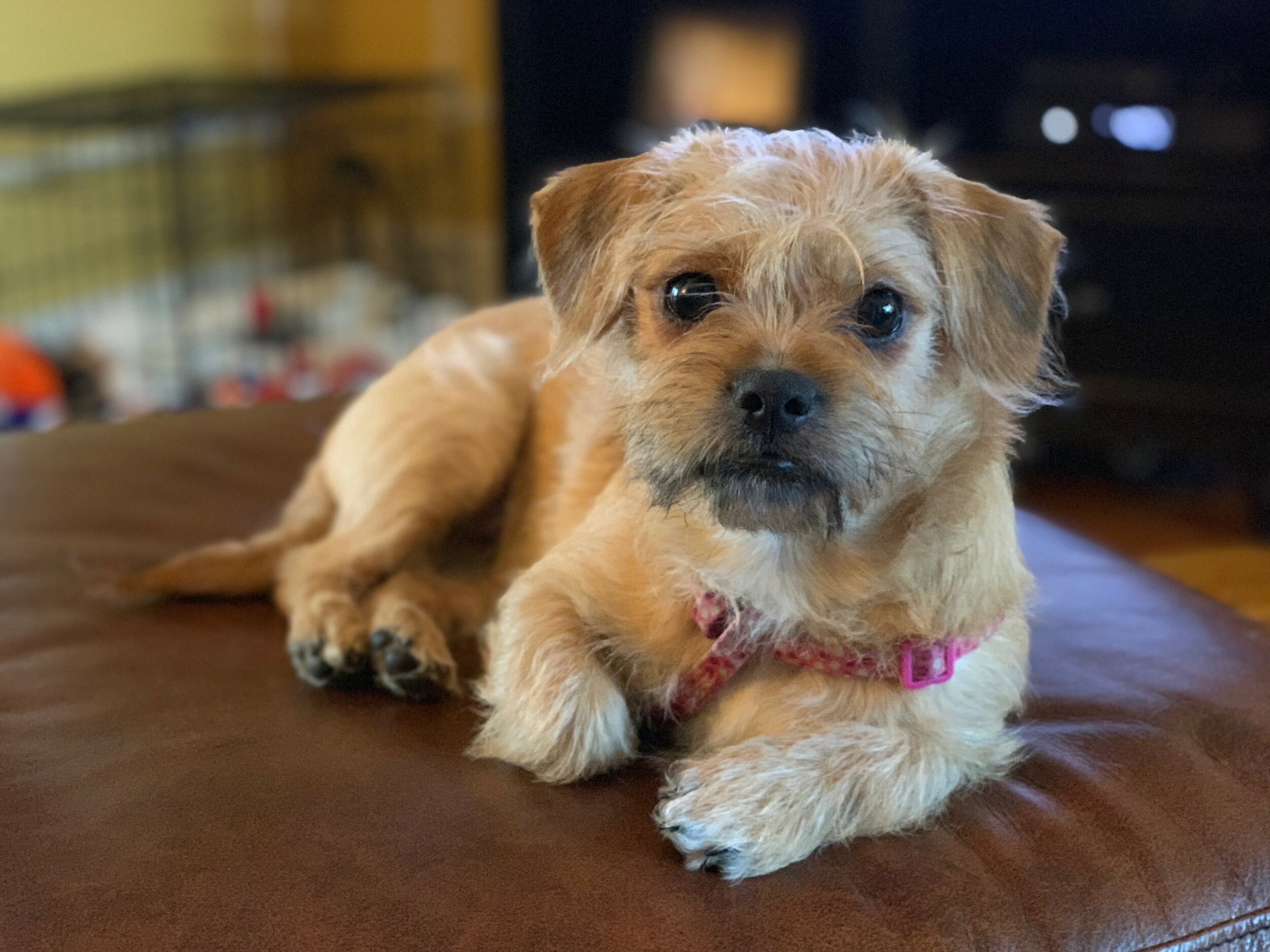
- Head and chest shots are excellent for portraits. Your pet can be looking directly into the lens or off to the side (sometimes profile shots can be awesome!) and he/she should fill the frame. Only the pet should be in the photo (no people/hands/laps, etc.). In some cases full body portraits can work quite well, but keep in mind that your pet’s face should be the focus of the painting.
Helpful hint: Crouch down to your pet’s level when taking photos rather than shooting from standing height. (Tougher on the knees, but it will make for a much nicer photo! )
Treats will certainly help encourage your pet to “pose” for photos! It’s helpful to enlist the help of a friend or family member during your photo session. If you’re having difficulty selecting a reference photo, I’ll be happy to work with you to determine the most appropriate choice. Keeping all of this in mind, the best photo is the one that melts your heart!
ABOUT PAINTING SURFACES
Oil
Do you plan to frame your portrait? I always ask my clients, because some canvases must be framed, while framing is optional for others. Let me explain:
My go-to surface is what’s called a gallery wrapped canvas. The depth of this canvas is typically 1.5 inches, and I paint the sides/top/bottom of the canvas to blend with the background color of the painting. The finished piece is then ready to hang. Gallery wrapped canvases are typically not framed, but they can be. However, due to the extra depth, the framing cost will be higher than that of a thinner canvas. Standard depth canvases (3/4” or 1/2”) look best framed. If you know that you plan to frame your portrait I will use a standard depth canvas.
Gallery depth canvases/panels (unframed) tend to have a more contemporary look. Framing can give the portrait added size and impact, and of course there are a myriad of choices to suit any portrait, space and decor. Online framing companies can be very cost-effective, and I’m happy to offer suggestions/recommendations, if desired. That said, nothing beats a professional framing job!
Pastel
All pastel portraits are painted on professional quality pastel paper. Pastel portraits must be framed under glass, with or without a mat. Professional framing is recommended. Professional framers will use spacers to ensure that pastel dust does not fall onto the mat board. Pastel paintings framed without matting MUST have spacers to keep the painting away from the glass.
If you do choose to mat and frame your pastel painting yourself, many art supply companies (I recommend Dick Blick, dickblick.com) sell very nice standard size mats (as well as frames) in a variety color options at reasonable prices. (You can also purchase inexpensive frames at big box stores like Michael’s, but I do not recommend using the mats that come with the frames because they are not acid free and can damage your painting over time.)
Just be aware that when a pastel painting is framed without spacers, it is likely that a spritz of pastel dust will collect on the lower beveled edge of the mat. This may or may not bother you.
Here’s a neat tip: when first framing your pastel, flip the beveled mat over, back to front. Any pastel dust that flakes off will land inside the mat along the beveled edge (which is now on the inside) and not on the visible part of the mat. However, if you don’t like that look and prefer to see the beveled side, just be aware that pastel dust happens!
That said, I have framed may pastels without spacers. Yes, I get some dust on the mat—it’s generally not enough to bother me.
Feel free to call or email with any questions!